Visualizing the FIDE World Chess Championship
Wednesday, May 10, 2023
This week is Never Graduate Week at the Recurse Center, where alumni come back to do Recurse-y things together. It's a great experience and I've had a lot of fun reconnecting with friends and meeting some new friends. But it wouldn't be an RC experience without working at the edge of your abilities! I did that this week by participating in the generative art day.
The day was structured nicely to help you push yourself to create something even if you haven't done it before. (Which is great, because I haven't!) The general structure was a kick-off call, then some hanging out together while we worked, and at the end we had presentations. The kick-off call was where we could meet each other and ask for help and share ideas. For me, this was a great place to validate that the idea I was working on was valid and interesting. Then in the hangout time, we just shared little updates (I was very excited when I got a line to draw) and could have some accountability by seeing someone else also working. The presentations at the end give you a nice target. They motivated me to finish something, which gave me a nice time constraint.
What I decided to do was visualize how the pieces moved during the FIDE World Chess Championship. I loaded in all the classical games (14 of them) from the event, parsed the game records, and recorded where the pieces moved. Then I plotted those on a chessboard!
This is the result (and here's the code):
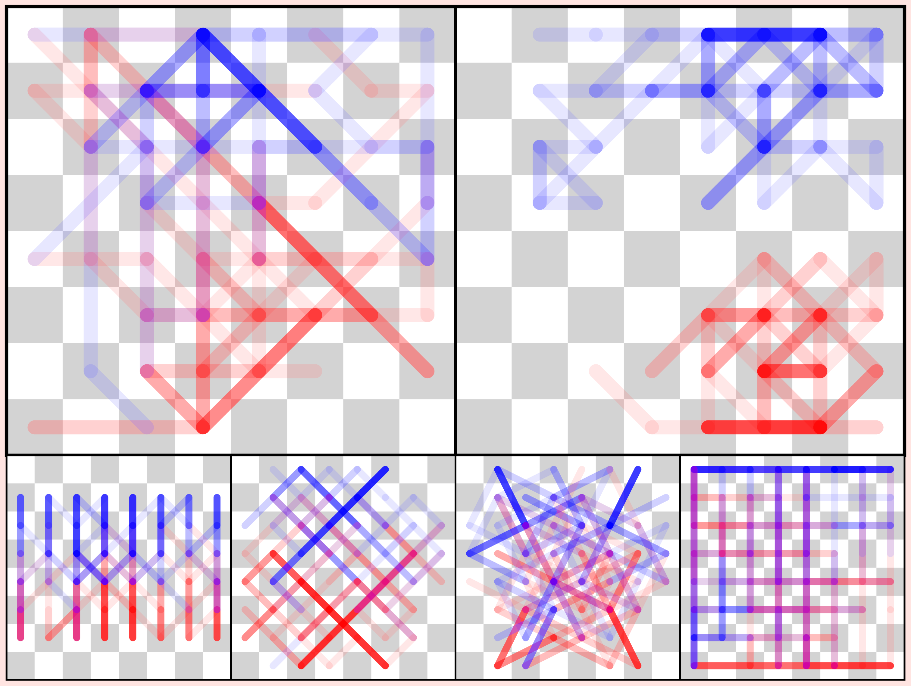
For each type of piece, I recorded each time it moved from a square to another one and plotted that as a line segment. Red represented the player with the white pieces, and blue is the player with the black pieces. The lines are transparent so the more often a piece took a particular path, the more opaque that line segment becomes.
Which pieces are which can be determined by inspecting how the piece trails are moving. Clockwise from the top left: queen, king, rooks, knights, bishops, pawns.
I thought the image would be interesting. What surprised me was what you could immediately learn from looking at it. There were a few insights I took away from this:
- The player with white never castled queenside
- No pawns were promoted
- The kings never passed the center line
- The rooks tended to infiltrate on the queenside, and clash in the center
I am thinking about adapting this for a Lichess dataset separated out by different rating bands. If you're interested in seeing anything in particular, let me know and I'll try sketching it up!
If you're looking for help on a software project, please consider working with me!
Please share this post, and subscribe to the newsletter or RSS feed. You can email my personal email with any comments or questions.
Want to become a better programmer?
Join the Recurse Center!
Want to hire great programmers?
Hire via Recurse Center!